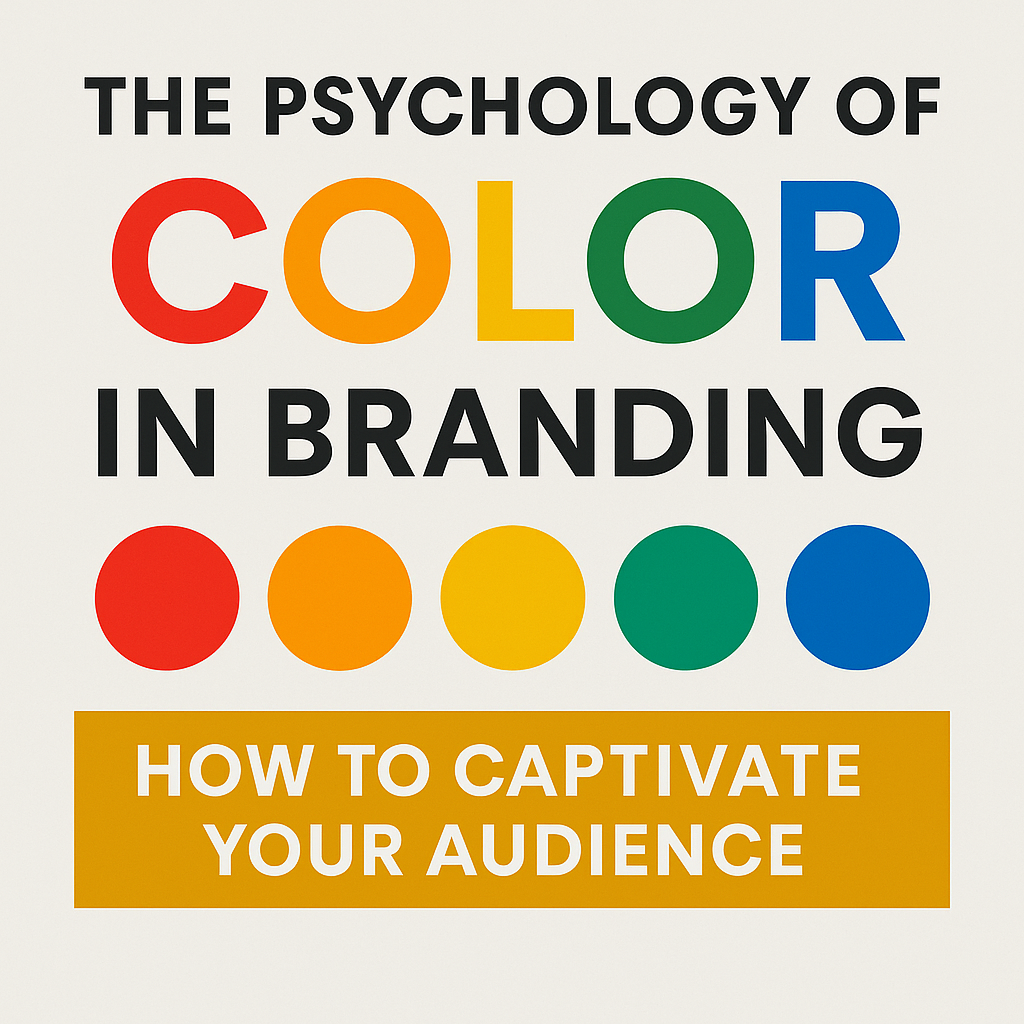
Why Color is More Than Just Decoration
Did you know people judge a brand in less than 90 seconds—and most of it is just color? That’s right—color isn’t decoration; it’s a powerful psychological tool.
The right hue can spark trust, excitement, or calm. It can make your brand memorable, recognizable, and irresistible. Choosing colors strategically isn’t optional—it’s essential for capturing attention and influencing decisions.
How the Brain Sees Color
Color isn’t just what meets the eye—it’s what happens in the brain. Different wavelengths trigger emotions, moods, and even decisions without us realizing it.
Our brains categorize millions of colors into emotional shortcuts, instantly signaling trust, energy, or calm. And since the brain processes visuals 60,000 times faster than text, color becomes your fastest way to communicate with customers.
The Emotional Impact of Colors on Consumers
Colors speak louder than words. Each hue triggers specific emotions and can influence behavior:
-
Red: Energy, urgency, action. Perfect for sales, call-to-action buttons, and brands like Coca-Cola, McDonald’s, KFC.
-
Blue: Trust, calm, professionalism. Popular with Facebook, IBM, PayPal.
-
Green: Growth, wellness, nature. Used by Whole Foods, Spotify, Starbucks.
-
Yellow: Optimism, creativity, attention. Highlights info and conveys friendliness—think IKEA, Best Buy.
Choosing the right color can instantly communicate your brand’s personality and guide how people feel about your business.
Cultural Differences in Color Meaning
Colors carry meaning—but that meaning isn’t universal. What signals joy in one culture might signal mourning in another. Ignoring these nuances can confuse your audience—or worse, damage your brand’s reputation.
-
Western cultures: White often represents purity and cleanliness, making it popular in healthcare and luxury brands. Black communicates sophistication and premium quality, which explains its use in high-end fashion and tech.
-
Eastern cultures: Red symbolizes luck and prosperity in China, while white can signify mourning or death in some Asian countries.
Global brands succeed by adapting their color strategies to local markets. For instance, McDonald’s swaps red for green in some Middle Eastern countries to align with cultural preferences and religious sensibilities.
Understanding these cultural differences ensures your brand resonates emotionally across regions, building trust and recognition no matter where your audience is.
How to Apply Color Psychology in Your Brand
Using color strategically isn’t guesswork—it’s about aligning hues with your brand personality and audience emotions. Here’s how:
1. Define Your Brand Personality
-
Are you innovative and energetic, or trustworthy and calm?
-
Create buyer personas including demographics, cultural background, and psychological preferences to guide your choices.
2. Choose Effective Color Combinations
-
Stick to 2–4 harmonious colors.
-
Use primary colors for your main identity and secondary colors for accents.
-
Apply color theory—complementary, analogous, or triadic schemes—for visual appeal.
-
Ensure contrast for readability and accessibility.
3. Test and Optimize
-
Use A/B testing on digital platforms, print materials, and packaging to see which colors resonate.
-
Track click-through rates, conversions, and brand recall.
-
Adjust based on real-world feedback and performance data.
Strategic color use ensures every visual touchpoint reinforces your brand, evokes the right emotions, and drives customer action.
Common Mistakes to Avoid
Even small color missteps can weaken your brand’s impact. Here’s what to watch out for:
1. Ignoring Your Audience
Choosing colors based on personal preference rather than your audience’s psychological and cultural preferences can create a disconnect. Always prioritize who you’re targeting.
2. Inconsistent Color Usage
Using colors inconsistently across websites, social media, and packaging confuses consumers and weakens recognition. Develop brand guidelines with exact color codes and rules.
3. Overcomplicating Your Palette
Too many colors dilute your message. Stick to 2–3 primary colors, with occasional accents to highlight key elements. Simplicity strengthens recall.
By avoiding these common errors, you ensure your color choices reinforce your brand identity and build trust rather than confusion.
Measuring the Impact of Color
Choosing the right colors is just the first step—tracking their effectiveness is essential. Use both quantitative and qualitative methods to understand their impact:
1. Quantitative Metrics
-
Conversion rates & engagement: Monitor clicks, sales, and interactions after changing colors.
-
Brand recognition: Test how easily customers recall your brand when exposed to your color palette.
-
Heat maps: See where users focus attention and which colors guide actions most effectively.
2. Qualitative Assessment
-
Surveys & focus groups: Ask how colors make people feel and what impressions they form about your brand.
-
Social media sentiment: Monitor comments, reviews, and mentions to see real-world reactions.
By combining data and feedback, you can fine-tune your color strategy, ensuring it strengthens your brand, resonates emotionally, and drives business results.
The Future of Color in Branding
Color in branding is evolving with technology and changing consumer expectations. Here’s what to watch for:
-
Dynamic digital experiences: Brands can now adapt colors in real-time on websites or apps based on context, time of day, or individual user preferences.
-
Augmented reality (AR): AR allows consumers to interact with products in different colors, creating personalized experiences.
-
Sustainability trends: Earth tones and natural colors are rising in popularity as brands emphasize environmental consciousness and responsibility.
Staying ahead of these trends lets brands connect deeper with audiences, communicate modern values, and remain visually compelling in a competitive landscape.
Make Color Work for Your Brand
Color isn’t just a design choice—it’s a powerful tool to influence perception, emotion, and action.
Take a close look at your brand palette. Are your colors:
-
Communicating your personality clearly?
-
Resonating with your audience across cultures?
-
Driving engagement and recognition?
By strategically applying color psychology, testing its impact, and adapting to trends, you can create a brand that’s not just seen, but remembered. Every color tells a story—make sure yours leaves a lasting impression.


Leave a Comment - (Links Acceptable)